
Nick Turchiaro-USA TODAY Sports
The New York Yankees have one of the most iconic home uniforms, not only in baseball, but in sports.
Their jerseys and pants are a crisp white with navy blue pinstripes. On the back is a navy blue number. The Yankees were the first team to make the number on the back a permanent part of the uniform, which initially indicated the player’s spot in the batting order (hence No. 3 for Babe Ruth and No. 4 for Lou Gehrig). More noticeable in today’s game is the absence of a last name. After all, the whole point of the number is to identify the player – adding a surname is excessive. On the front left breast is an interlocking navy blue NY. The navy blue cap features the same logo in white.
Aside from maybe the St. Louis Cardinals, there is not a better home uniform in baseball. It may be simple but the historical aspect (unchanged since 1936) makes it phenomenal. The uniforms are not boring – they’re timeless. Unfortunately, the same cannot be said for the Bombers’ road uniforms.
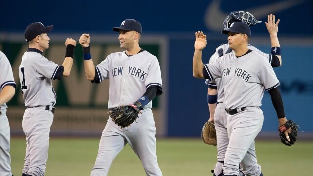
As the visiting team, the Yankees wear gray uniforms with a navy blue “NEW YORK” across the chest, trimmed in white. The sleeves feature white piping with navy blue trim. In a word, they’re boring.
It would be a sin to change the home uniforms, but the Yankees should alter their road grays. I believe they should go with one of three options, all of which involve reviving an older road jersey.
Option No. 1: go back to the old road uniform without the white trim. I’d make one minor change, however. Rather than displaying “NEW YORK” across the chest in block lettering, change the font to match the NY on the hat. Most teams’ road jerseys simply display their city’s name in script. This change would give New York’s road uniform a classic style but would also be unique to the Yankees because no other team utilizes that typeface.
Option No. 2: do the same thing as option number one but with “YANKEES” across the chest. They wore road jerseys with this design from 1927-1930. The Yanks had pretty good seasons during those years.
Option No. 3: adopt the 1912 throwbacks that they wore in 2012 for Fenway Park’s centennial. These feature a gray uniform with an interlocking NY on the left breast. It’s essentially the same thing as the home uniform minus the pinstripes. The way I see it: if it ain’t broke, don’t fix it. The home jersey is perfect so there’s nothing wrong with using the same template on the road.
There is one change, however. This uniform also featured a gray cap with a navy blue peak and an interlocking navy blue NY. In case you couldn’t already tell, I’m a traditionalist so I normally wouldn’t support adding a new hat. Nevertheless, I like the throwback so much I’d be all for making it permanent.
All of these changes would emphasize an historic aesthetic while simultaneously setting the Yankees apart — much like the home uniforms.
James O’Hare is a writer for www.RantSports.com. Follow him on Twitter @JimboOHare, like him on Facebook and add him to your network on Google.


