The 15 Ugliest MLB Throwback Jerseys of All Time

Getty Images
Every now and then, MLB teams have an idea for a new jersey. Back in the day, that created some pretty awesome jerseys. Unfortunately, it also created some pretty awful ones as well. These 15 jerseys were the worst of the past.
15. 1980s Philadelphia Phillies

Classic Kicks
15. 1980s Philadelphia Phillies

Classic Kicks
14. "1980s" Tampa Bay Rays

MLB
14. "1980s" Tampa Bay Rays

MLB
13. 1980 Chicago White Sox

Distant Replays
13. 1980 Chicago White Sox

Distant Replays
12. 1976 Texas Rangers

Top Prospect Alert
12. 1976 Texas Rangers

Top Prospect Alert
11. 1999 Pittsburgh Pirates
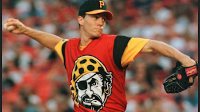
Getty Images
11. 1999 Pittsburgh Pirates

Getty Images
10. 1980s Cleveland Indians

Getty Images
10. 1980s Cleveland Indians

Getty Images
9. 1999 New York Mets

Getty Images
9. 1999 New York Mets

Getty Images
8. Early 2000s Tampa Bay Devil Rays

Getty Images
8. Early 2000s Tampa Bay Devil Rays

Getty Images
7. 1980s Philadelphia Phillies

Top Tenz
7. 1980s Philadelphia Phillies

Top Tenz
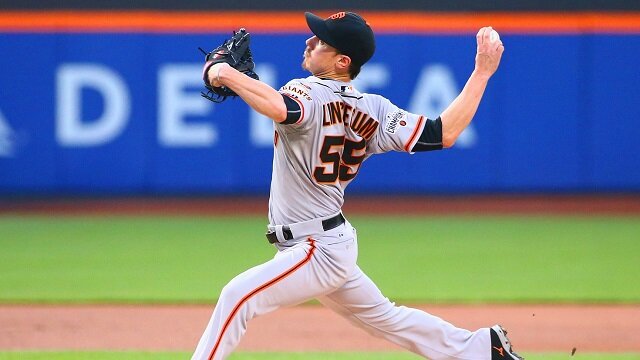
6. 1999 San Francisco Giants

Getty Images
6. 1999 San Francisco Giants

Getty Images
5. 1962 Houston Astros

The Score
5. 1962 Houston Astros

The Score
4. 1970s Seattle Mariners

Sports On Earth
4. 1970s Seattle Mariners

Sports On Earth
3. 1977 Pittsburgh Pirates

Getty Images
3. 1977 Pittsburgh Pirates

Getty Images
2. 1999 Colorado Rockies

Getty Images
2. 1999 Colorado Rockies

Getty Images
1. 1978 San Diego Padres

Distant Replays
1. 1978 San Diego Padres

Distant Replays
 Share
Share