Obviously, winning comes first, but looking good is a close second for a lot of athletes. Here is every MLB logo ranked from the most worst to first.
30. Chicago White Sox
 Credit: Jon Durr-USA Today Sports
30. Chicago White Sox
There's pretty much nothing interesting about the White Sox's logo. It has withstood the test of time, but that's not necessarily a good thing. Add the fact that the logo is just black and white and you have the league's most boring logo.
29. Cincinnati Reds
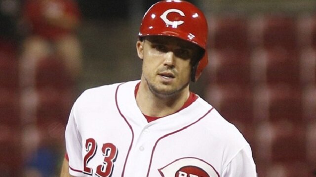 Credit: David Kohl-USA Today Sports
29. Cincinnati Reds
The Reds are another historic team with a pretty underwhelming logo. Sure, it looks pretty sharp, but it doesn't have a whole lot going on. This really stinks for Cincinnati fans who won't be able to find solace in their team's logo during a lost season.
28. Philadelphia Phillies
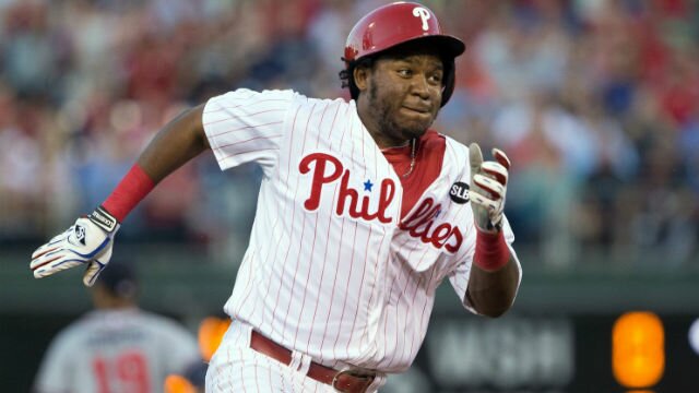 Credit: Bill Streicher-USA Today Sports
28. Philadelphia Phillies
The simple "P" logo on the Phillies' caps is below-average. The logo is relatively solid on their jerseys, but it's just not a complete package when you put it all together.
27. San Diego Padres
 Credit: Jake Roth-USA Today Sports
27. San Diego Padres
Once upon a time, the Padres had a pretty cool logo, but it now looks pretty lame. Sure, the camouflage alternates are awesome, but the team's default navy blue and gold logo is less than impressive.
26. Tampa Bay Rays
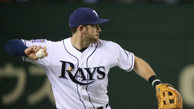 Credit: MLB
26. Tampa Bay Rays
The Rays are another team that had a much better logo before changing it. That old-school Devil Rays logo was among the best in the league, even if the team was consistently losing 100 games a year.
25. Milwaukee Brewers
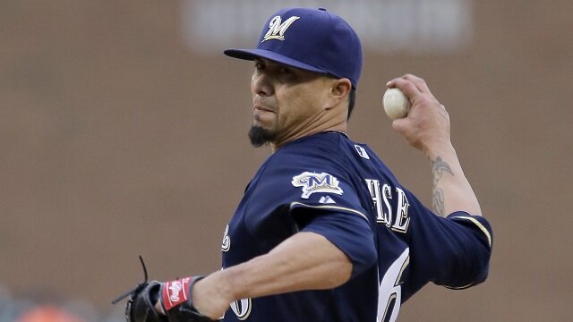 Credit: Getty Images
25. Milwaukee Brewers
Milwaukee has a very cool mascot, but he isn't featured in their logo, so it doesn't really count. The Brewers' logo looks sharp, but that's about it.
24. Washington Nationals
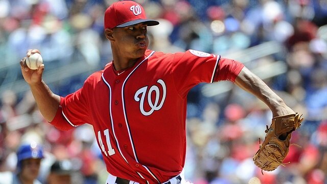 Credit: Brad Mills-USA Today Sports
24. Washington Nationals
Washington's logo looks fine, but it doesn't jump right out at you. The red, white and blue color scheme is cool for a team playing in the nation's capital, but it still fails to inspire like some of the other team logos do.
23. Texas Rangers
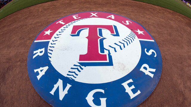 Credit: Jerome Miron-USA Today Sports
23. Texas Rangers
The Rangers' logo is extremely simple, like many logos in the league. If the team would jazz it up a little bit more, it could be one of the better logos in baseball.
22. New York Mets
22. New York Mets
The New York skyline is a nice touch in the Mets' logo, but that's the only aspect that sets it apart. If the team could find a way to incorporate the "Big Apple" aspect of their location, it would be in the top 10.
21. Minnesota Twins
21. Minnesota Twins
The Twins have a logo that simply consists of letters representative of their location. What makes this one a little cooler than most is that it stands for "Twin Cities" rather than just Minneapolis or Minnesota.
20. Los Angeles Angels
 Credit: Getty Images
20. Los Angeles Angels
The "A" with the halo around it is a really nice touch. This team has changed its logo consistently over the years, but should stick with the one it currently has.
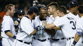
19. Detroit Tigers
 Credit: Getty Images
19. Detroit Tigers
Detroit's logo is fancy, and it's also historic, which makes it really cool. Sure, nobody is going to be blown away by it, but the fact that Ty Cobb and Hank Greenberg wore this same logo on their jerseys makes it way cooler than a lot of the other logos on this list.
18. Houston Astros
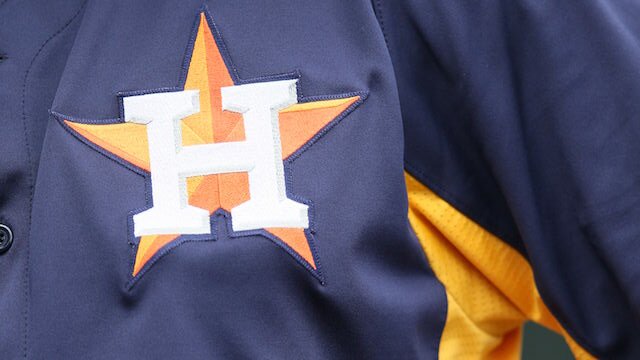 Credit: Getty Images
18. Houston Astros
Houston has always had a cool color scheme with different shades of orange, and the latest iteration is pretty sharp. Now that the team is competitive, more fans will get to appreciate it.
17. Atlanta Braves
17. Atlanta Braves
Without the tomahawk, the Braves would be pretty far down on this list, but the tool definitely vaults it into the middle group of logos. Any time an aspect of a logo inspires a chant, you know it must be pretty interesting.
16. Oakland Athletics
 Credit: Getty Images
16. Oakland Athletics
If you include the elephant part of the Athletics' alternate logo, the team would be higher on this list. The green and yellow combination really works in Oakland, but the logo design itself is relatively underwhelming. It has remained largely the same over time, though, which is pretty impressive.
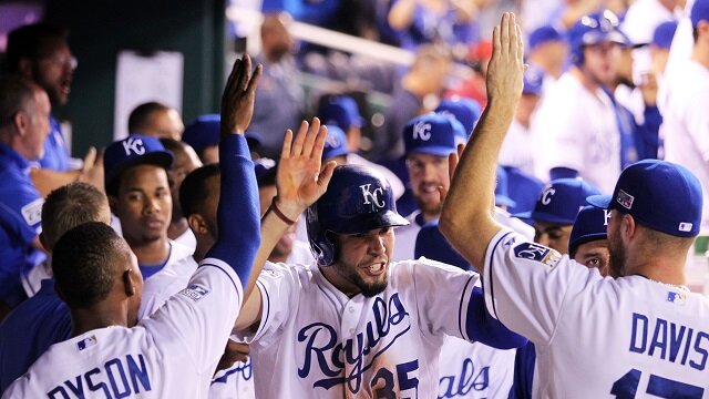
15. Kansas City Royals
 Credit: Getty Images
15. Kansas City Royals
Kansas City is coming off two straight World Series appearances with one win, and has a logo that is right in the middle of the league in terms of design. The crown on the top of the logo is a really nice touch.
14. Colorado Rockies
 Credit: Getty Images
14. Colorado Rockies
When a team uses parts of its geography in its logo, it instantly adds cool factor. The baseball being hit over the Rocky Mountains is a nice touch.
13. Los Angeles Dodgers
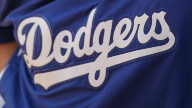 Credit: Getty Images
13. Los Angeles Dodgers
Historic teams tend to resist change, and the Dodgers have remained mostly the same as far as their uniform goes. There's value in that iconic logo.
12. Boston Red Sox
 Credit: Getty Images
12. Boston Red Sox
Boston is one of baseball's most historic franchises, and its logo is a classic. It isn't changing any time soon, and fans in Boston should be perfectly okay with that.
11. New York Yankees
11. New York Yankees
New York's logo is incredibly simplistic, but it represents a brand and a storied history. Think of all the players who have worn this logo. The Bronx Bombers will always have the same logo, and that's exactly how it should be.
10. St. Louis Cardinals
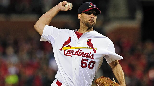 Credit: Jeff Curry-USA TODAY SPORTS
10. St. Louis Cardinals
St. Louis is yet another historic franchise with a cool logo. This one has slightly changed over the years, but the general look has remained the same. The logo has come to represent a winning pedigree, something Cardinals players are fully aware of.
9. San Francisco Giants
9. San Francisco Giants
The Giants changed their logo when they moved to San Francisco, and the black, gray and orange color scheme looks really sharp. Winning three of the past six World Series certainly doesn't hurt the value of the look either.
8. Chicago Cubs
 Credit: Larry Lai-USA Today Sports
8. Chicago Cubs
The Cubs are one of the league's most historic franchises and its uniform has stayed largely untouched over the years. Seeing that logo always gets the voracious Cubs fanbase excited. That the team is now competitive won't hurt that, of course.
7. Cleveland Indians
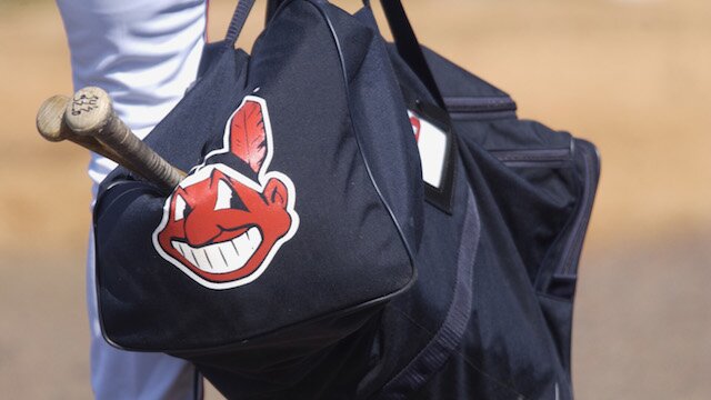 Credit: Getty Images
7. Cleveland Indians
Cleveland has tried transitioning to a boring "C" logo on its hats, but the indian head logo is much better. Some will argue the logo is as insulting and insensitive as the Redskins' and they have a fair argument, though the design is definitely sharp.
6. Miami Marlins
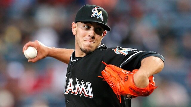 Credit: Getty Images
6. Miami Marlins
Black, orange and turquoise wouldn't seem to work together, but they do in the Marlins' logo. Add the Marlin poking out the top of the "M," and Miami has one of the league's coolest logos.
5. Seattle Mariners
 Credit: Getty Images
5. Seattle Mariners
This logo earns high marks for creativity. It involves a compass, which is something very important to a mariner, and is something that most people probably don't realize.
4. Arizona Diamondbacks
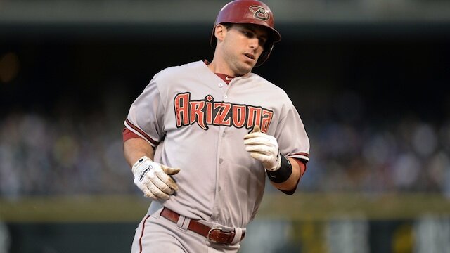 Credit: Getty Images
4. Arizona Diamondbacks
Arizona is a pretty young franchise, but it has already changed its logo and colors a few times. They should stop while they're ahead and keep the latest redesign (not pictured) around.
3. Baltimore Orioles
3. Baltimore Orioles
Baltimore has a very cool color scheme, and the updated oriole logo is excellent -- just icing on the cake for a good franchise with a strong tradition.
2. Pittsburgh Pirates
2. Pittsburgh Pirates
The Pirates are an old-school team whose logo looks like it's stuck in the 1970s -- in a good way. This classic pirate is awesome, especially when paired with the team's great red, yellow and black color scheme. Now that the team is winning, it's like they're throwing back to when the team was competitive.
1. Toronto Blue Jays
1. Toronto Blue Jays
No team combines great colors and design elements better than the only team that plays north of the border. Dark and light blue with red is a great combination, and it works particularly well for Toronto. The Blue Jays have the greatest logo in the league, and there really isn't anyone close at this point.
 Share
Share