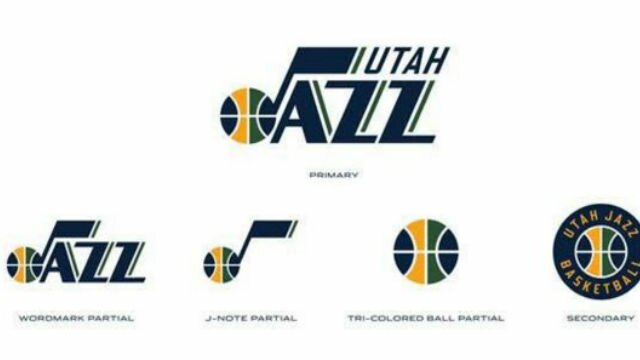
Following in the recent footsteps of the Sacramento Kings, the Utah Jazz have unveiled new logos for the 2016-17 NBA season.
EXCLUSIVE: T-shirts show new Utah Jazz logos. My understanding is that the official unveiling will be tomorrow. pic.twitter.com/ex1jFk8vR3
— Paul Lukas (@UniWatch) May 11, 2016
The musical note look to the logo was re-established by the Jazz a handful of years ago. But the “Utah” over the two Z’s is a new addition, along with a complete phase-out of the mountain range backdrop that had been on the team’s primary logo.
New logos are generally an excuse to create new merchandise and promote sales, which is not necessarily wrong. But the new logos for the Jazz look cool, to go along with an underrated young team that will take the floor next season.
 Share
Share