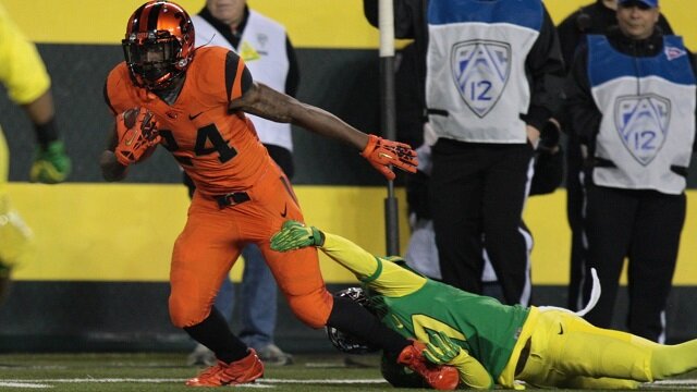
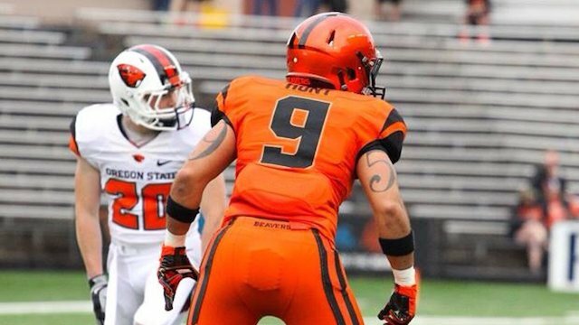
According to buzz around the Internet this afternoon, the Oregon State Beavers are following the lead of their in-state rival, the Oregon Ducks, and undergoing a logo redesign which will spruce things up prior to the 2013 season.
NFL.com art director Mike Brisk shared a photo on Instagram this afternoon that generated the first of the buzz, and several blogs picked up on the logo below — looking like a somewhat more fierce version of the previous incarnation:

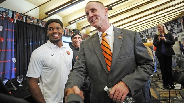
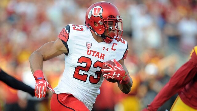
It makes perfect sense that Oregon State would go with a re-design of their logo — especially after landing what is arguably the best recruiting class in program history — the “swag factor” is as high as its ever been and the Beavers are convinced they have a legitimate shot at a Pac-12 Conference title in 2013 — especially with the overall lack of depth in the conference with so many first-tier players leaving and top teams scrambling to fill in the gaps.
In the world of big-money college football having this swag factor is a sure-fire way to gain the attention of potential recruits. In fact, it could even be argued, that it’s just as important as how your team actually plays on the field. Make no mistake, the top recruits in college football from year-to-year want to play at a high level and look damn good doing it.
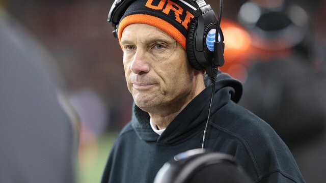
It looks like Mike Riley has caught on to this, and if the Beavers’ new logo comes to fruition with some new uni designs, they’ll be certain to reap the benefit in the 2014 class.
—-
Kris Hughes is the College Football Network Manager for Rant Sports. You can follow Kris on Twitter, Google Plus and Facebook
 Share
Share