Ranking Every NFL Team Logo From Worst to First
Getty Images
Every NFL team has a logo. Here they are ranked from worst to first.
32. Cleveland Browns

Jeff Hanisch-USA TODAY Sports
32. Cleveland Browns

Jeff Hanisch-USA TODAY Sports
31. Jacksonville Jaguars

Getty Images
31. Jacksonville Jaguars
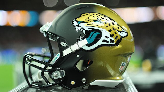
Getty Images
30. Tampa Bay Buccaneers

Getty Images
30. Tampa Bay Buccaneers

Getty Images
29. Carolina Panthers

Getty Images
29. Carolina Panthers
Getty Images
28. Miami Dolphins

Kevin Hoffman - USA TODAY Sports
28. Miami Dolphins

Kevin Hoffman - USA TODAY Sports
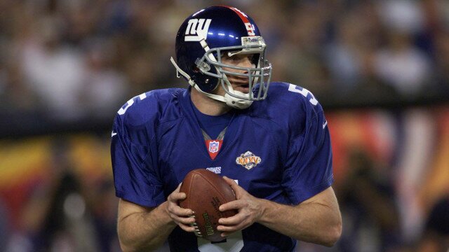
27. New York Giants

Getty Images
27. New York Giants

Getty Images
26. New England Patriots

Mark J. Rebilas-USA TODAY Sports
26. New England Patriots

Mark J. Rebilas-USA TODAY Sports
25. New Orleans Saints

Getty Images
25. New Orleans Saints
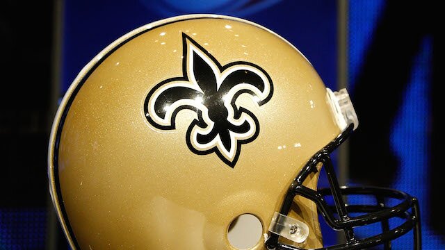
Getty Images
24. Minnesota Vikings

Brett Davis-USA TODAY Sports
24. Minnesota Vikings

Brett Davis-USA TODAY Sports
23. Buffalo Bills

Robert Mayer-USA TODAY Sports
23. Buffalo Bills

Robert Mayer-USA TODAY Sports
22. New York Jets

Getty Images
22. New York Jets

Getty Images
21. Philadelphia Eagles

Getty Images
21. Philadelphia Eagles

Getty Images
20. Washington Redskins

Getty Images
20. Washington Redskins

Getty Images
19. Dallas Cowboys

Getty Images
19. Dallas Cowboys

Getty Images
18. Chicago Bears

Getty Images
18. Chicago Bears

Getty Images
17. St. Louis Rams

Getty Images
17. St. Louis Rams

Getty Images
16. Houston Texans

Brett Davis-USA TODAY Sports
16. Houston Texans

Brett Davis-USA TODAY Sports
15. San Diego Chargers

Mark J. Rebilas-USA TODAY Sports
15. San Diego Chargers

Mark J. Rebilas-USA TODAY Sports
14. Atlanta Falcons

Mitch Stringer-USA TODAY Sports
14. Atlanta Falcons
Mitch Stringer-USA TODAY Sports
13. Baltimore Ravens

Charles LeClaire-USA TODAY Sports
13. Baltimore Ravens

Charles LeClaire-USA TODAY Sports
12. Cincinnati Bengals
Kirby Lee-USA TODAY Sports
12. Cincinnati Bengals

Kirby Lee-USA TODAY Sports
11. Kansas City Chiefs

John Rieger-USA TODAY Sports
11. Kansas City Chiefs

John Rieger-USA TODAY Sports
10. Oakland Raiders
Pat Lovell-USA TODAY Sports
10. Oakland Raiders

Pat Lovell-USA TODAY Sports
9. Indianapolis Colts

Mark J. Rebilas-USA TODAY Sports
9. Indianapolis Colts

Mark J. Rebilas-USA TODAY Sports
8. Tennessee Titans

Timothy T. Ludwig-USA TODAY Sports
8. Tennessee Titans
Timothy T. Ludwig-USA TODAY Sports
7. Seattle Seahawks

Timothy T. Ludwig-USA TODAY Sports
7. Seattle Seahawks

Timothy T. Ludwig-USA TODAY Sports
6. Green Bay Packers

Mitch Stringer-USA TODAY Sports
6. Green Bay Packers

Mitch Stringer-USA TODAY Sports
5. Pittsburgh Steelers
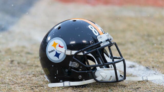
Jeff Hanisch-USA TODAY Sports
5. Pittsburgh Steelers

Jeff Hanisch-USA TODAY Sports
If a logo ever represented a city, it would take notes from the Pittsburgh Steelers. Hard-nosed, rough around the edges and blue collar to the core, this is the perfect logo for the team.
4. Arizona Cardinals
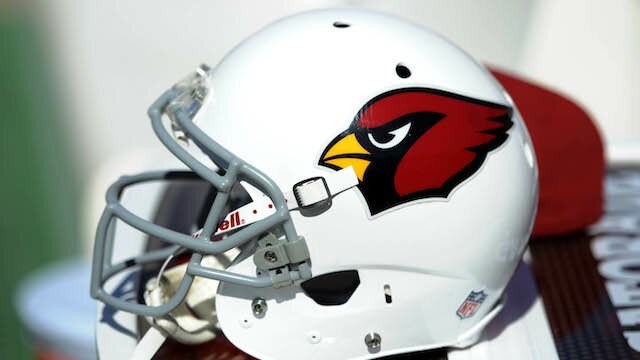
Bob Stanton-USA TODAY Sports
4. Arizona Cardinals
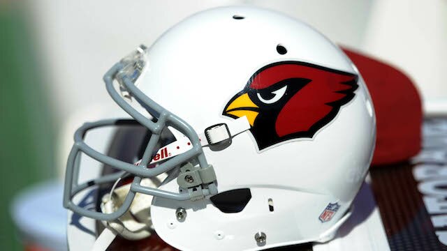
Bob Stanton-USA TODAY Sports
3. San Francisco 49ers
Mark J. Rebilas-USA TODAY Sports
3. San Francisco 49ers
Mark J. Rebilas-USA TODAY Sports
2. Detroit Lions
Getty Images
2. Detroit Lions
Getty Images
1. Denver Broncos
Getty Images
1. Denver Broncos
Getty Images
 Share
Share