Ever wondered what your favorite NFL team’s logo would look like if it were redesigned a bit? Wonder no more. A friend of the Rant family has redesigned every NFL logo — for fun (and in just 12 days!) — and the results are pretty cool.

Arizona Cardinals
 Credit: Addison Foote/Behance
Arizona Cardinals
Simple, but effective. The really cool thing about this look is it almost reminds you of a college logo.
Atlanta Falcons
 Credit: Addison Foote/Behance
Atlanta Falcons
Not a whole lot was changed here, but you have to love the more aggressive looking Falcon. It is a bird of prey after all.
Baltimore Ravens
 Credit: Addison Foote/Behance
Baltimore Ravens
A much sharper looking Raven, Baltimore's mascot has a more clean-cut look. With an all purple helmet, this could look pretty darn cool.
Buffalo Bills
 Credit: Addison Foote/Behance
Buffalo Bills
Again, not a lot is changed here, but the Buffalo logo does look like it's a little sleeker. It's 2016, so maybe it's time for this change to actually be made.
Carolina Panthers
 Credit: Addison Foote/Behance
Carolina Panthers
You can't help but think this looks like a custom logo you would've been able to create on Madden in "Create a Team" mode. It also looks like pink panther may have gone rogue.
Chicago Bears
 Credit: Addison Foote/Behance
Chicago Bears
It's hard to make such a classic logo look good in a redesign, but this one looks pretty cool. The Bear is much more aggressive looking, and that's something the Monsters of the Midway need right now as they've lost their identity as a team in recent years.
Cincinnati Bengals
 Credit: Addison Foote/Behance
Cincinnati Bengals
The Bengals have been in need of an actual Bengal for a while now and here it is. No more simple letter or stripes on the helmet; here's their new mascot.
Cleveland Browns
 Credit: Addison Foote/Behance
Cleveland Browns
Given how passionate the Dog Pound is, even when the Browns are terrible, the Bulldog had to be incorporated into the logo at some point. Here's to hoping this one is actually adopted someday.
Dallas Cowboys
 Credit: Addison Foote/Behance
Dallas Cowboys
The Cowboys have always been sharp looking, so it makes sense not to go over the top on this one. It looks new age while still capturing the sharpness of America's Team's logo.
Denver Broncos
 Credit: Addison Foote/Behance
Denver Broncos
Now this one is cool because it combines two of the team's past logos. You can see the actual Bronco, but he's on top of the old-school "D". By merging the past and present, this is one of the coolest redesigns in the bunch.
Detroit Lions
 Credit: Addison Foote/Behance
Detroit Lions
Don't deny it; you thought this looked like a seal from Hogwarts. This Lion looks a whole lot more intense than the team's current mascot, so maybe they should look into it.
Green Bay Packers
 Credit: Addison Foote/Behance
Green Bay Packers
This is one of the most drastic changes to any logo, but it's really sweet looking. The "G" and "B" are still in the design, but they're so tangled that it looks like a whole new logo.
Houston Texans
 Credit: Addison Foote/Behance
Houston Texans
Whether this was the intention or not, the angle of this logo makes it look like it a cowboy in a hat wearing a bandanna across his face. If that doesn't embody old-school Texas, nothing does.
Indianapolis Colts
 Credit: Addison Foote/Behance
Indianapolis Colts
The biggest change here, of course, is that the horseshoe is placed on its side. Honestly, this makes more sense. It's the first letter of the team's name and looks a little sharper.
Jacksonville Jaguars
 Credit: Addison Foote/Behance
Jacksonville Jaguars
That's one angry Jaguar. It looks like he's sticking his tongue out at you, but it also looks like he wants to eat you. Jacksonville is entering a new era as a team, so maybe a new logo is in order as well.
Kansas City Chiefs
 Credit: Addison Foote/Behance
Kansas City Chiefs
The Chiefs are an historic franchise, and this logo definitely looks like a throwback. The arrowhead is positioned differently, but it really works. It's always cool when someone can make a new logo look like an old one.
Los Angeles Rams
 Credit: Addison Foote/Behance
Los Angeles Rams
With a new city comes a new logo. Keeping the "L.A." in the logo was essential and the Ram is facing head on. That looks a whole lot better than what they've had recently.
Miami Dolphins
 Credit: Addison Foote/Behance
Miami Dolphins
Like the Bills logo, this one didn't change a whole lot, but it looks a bit sleeker. The Dolphin head is a bit more rounded and it also looks more intense.
Minnesota Vikings
 Credit: Addison Foote/Behance
Minnesota Vikings
As the Vikings prepare to move into their new home, maybe they need a new logo. This one keeps all the great elements of their current logo and places it on a "V" backdrop, which looks really sharp.
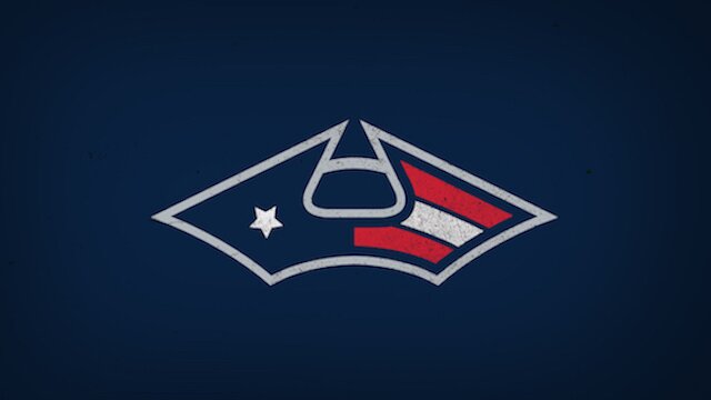
New England Patriots
 Credit: Addison Foote/Behance
New England Patriots
No matter what the Patriots are wearing, they will always be competitive. However, this new logo is cool because it seems like a throwback to the founding fathers. Based on the team's name, that obviously makes sense.
New Orleans Saints
 Credit: Addison Foote/Behance
New Orleans Saints
The fleur-de-lys is an iconic image in New Orleans, and this logo redesign makes it look even more impressive. It looks less like the simple logo of a football team and more the symbol of the city and its people.
New York Giants
 Credit: Addison Foote/Behance
New York Giants
Almost nothing changed in this logo, but the "N" and "Y" are combined into one another. It doesn't seem like the team needs a logo change, but if they did, this would be a pretty good option.
New York Jets
 Credit: Addison Foote/Behance
New York Jets
Given their name is the Jets, it certainly makes sense for the team to actually have a Jet in their logo. This is brilliant as it combines the "J" for the logo with an actual jet.
Oakland Raiders
 Credit: Addison Foote/Behance
Oakland Raiders
Nearly nothing is changed here, but turning the Raider head into a skull is a great touch. It makes it look more intense without completely taking away from the original logo.
Philadelphia Eagles
 Credit: Addison Foote/Behance
Philadelphia Eagles
What a valiant looking Eagle. He's staring off into the distance, pondering. Perhaps he's pondering what the Eagles will do now without a sense of direction heading into the 2016 season.
Pittsburgh Steelers
 Credit: Addison Foote/Behance
Pittsburgh Steelers
This might just be the coolest redesign of the bunch. It almost looks like a graphic from an old Atari game or something. Pittsburgh could easily transition to this from their current logo without missing a beat.
San Diego Chargers
 Credit: Getty Images
San Diego Chargers
This is one of the rare logos where a completely new element is actually added in. It almost gives "Chargers" a double meaning. It's like an electric charge and a charge of horses. That's a nice touch.
San Francisco 49ers
 Credit: Addison Foote/Behance
San Francisco 49ers
The current 49ers logo doesn't leave a lot to work with, but this redesign looks pretty cool. Stacking the letters vertically just makes it look a little cleaner.
Seattle Seahawks
 Credit: Addison Foote/Behance
Seattle Seahawks
That Seahawk does not look happy. Instead of its current round head, this one is a little more jagged, which makes the mascot look a little more intense.
Tampa Bay Buccaneers
 Credit: Addison Foote/Behance
Tampa Bay Buccaneers
It looks like the team's original Buccaneer mascot finally met his maker. That's fine because the skull with the sword in his mouth looks way cooler anyway.
Tennessee Titans
 Credit: Addison Foote/Behance
Tennessee Titans
The Titans need to adopt this as their new logo and they need to do it now. A team like the Titans needs a cool logo based on their mascot, and this one gives it to them. An actual Titan on their helmet is essential.
Washington Redskins
 Credit: Addison Foote/Behance
Washington Redskins
Here's another example of a new logo that looks a lot like it's an old one. It's simple, but effective and would likely look really sharp on helmets and shoulder pads in Washington.
 Share
Share 


