Every NBA franchise has a logo that its respective fanbase has grown to adore whether it’s visually appealing or not. The unconditional love fans have for their team is what makes professional sports so amazing.
However, many teams have ugly logos in the minds of outsiders. With that in mind, here’s a look at every team’s primary logo ranked from worst to first.
Timothy Downs is a Senior Writer for www.RantSports.com. You can ‘like him’ on Facebook add him on Google or follow him Twitter @Tidow1212
30. Los Angeles Clippers
 Credit: Twitter
30. Los Angeles Clippers
The new Los Angeles Clippers logo earns the title of worst in the NBA. You would think an owner who paid $2 billion for the team could find a better graphic designer. Considering the Clippers' nickname has to do with sailing, a boat of some sort should have been incorporated into the mix. But, no. No boat to be found.
29. Portland Trail Blazers
 Credit: Twitter
29. Portland Trail Blazers
The Portland Trail Blazers need a rebrand in the worst way. The tilting pinwheel was fine in the 1970s, but with modern technology, there's no doubt in my mind the franchise can come up with something more visually appealing.
28. Detroit Pistons
 Credit: Twitter
28. Detroit Pistons
The Detroit Pistons logo is painfully bland. If they are going to go the basic route, I'd rather see them use their throwback logo than their modern day primary.
27. New York Knicks
 Credit: Twitter
27. New York Knicks
The New York Knicks logo leaves plenty to be desired. Along with an influx of talent and a new owner, the Knickerbockers are in desperate need of a rebrand.
26. Indiana Pacers
 Credit: Twitter
26. Indiana Pacers
The Indiana Pacers are another franchise in dire need of a rebrand. Perhaps something involving a pace car or racing in general would be wise to incorporate into the mix, as that is what the nickname is based on.
25. Phoenix Suns
 Credit: Twitter
25. Phoenix Suns
The Phoenix Suns have no excuse for having a lackluster logo considering their nickname gives them so much to work with. Phoenix undoubtedly needs to rebrand its primary over the next few seasons.
24. Utah Jazz
 Credit: Twitter
24. Utah Jazz
The Utah Jazz's logo isn't ugly by any means. However, the 'Jazz' in the logo just looks out of place with the mountainous background. The franchise was born in New Orleans, which has a rich history of Jazz music. Thus, the Jazz nickname will always be out of place in Salt Lake City.
23. Oklahoma City Thunder
 Credit: Getty Images
23. Oklahoma City Thunder
The Oklahoma City Thunder's logo is an epic fail. I understand it was designed in a hurry as the team transitioned after relocating from Seattle, but with so many expert graphic artists available nowadays, they have no legitimate excuse for failing to come through.
22. Cleveland Cavaliers
 Credit: Twitter
22. Cleveland Cavaliers
The Cleveland Cavaliers have the most popular player on the planet in LeBron James, but you wouldn't know it by looking at their totally basic logo.
21. Denver Nuggets
 Credit: Twitter
21. Denver Nuggets
The Denver Nuggets are in dire need of spicing up their logo.
20. Minnesota Timberwolves
 Credit: Getty Images
20. Minnesota Timberwolves
Some franchises showcase painfully boring logos, and others go a tad too far with their design. The Minnesota Timberwolves undoubtedly fall into the latter category. The trees need to be permanently removed.
19. Los Angeles Lakers
 Credit: Getty Images
19. Los Angeles Lakers
I don't care how much winning the franchise has done, the Los Angeles Lakers showcase an abysmal logo.
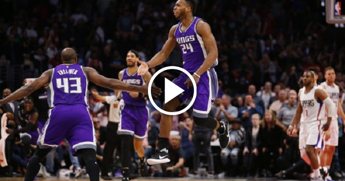
18. Sacramento Kings
 Credit: Getty Images
18. Sacramento Kings
The Sacramento Kings will open a new arena next season, which makes now a better time than ever to make some adjustments to their logo. The Kings have top five potential with a few tweaks.
17. Orlando Magic
 Credit: Getty Images
17. Orlando Magic
As funky as it was, the Orlando Magic's original logo was much more appealing than their current primary.
16. Houston Rockets
 Credit: Getty Images
16. Houston Rockets
The Houston Rockets logo is basic at best. There's nothing wrong with it, per se. But it's not incredibly appealing.
15. New Orleans Pelicans
 Credit: Twitter
15. New Orleans Pelicans
The New Orleans Pelicans' color scheme isn't incredibly appealing, but the logo is well designed. There isn't much to complain about with this one.
14. Memphis Grizzlies
 Credit: Twitter
14. Memphis Grizzlies
Based on design, the Memphis Grizzlies logo is a top five in my eyes. However, it falls to No. 14 due to the fact that grizzlies and Memphis just don't make a plethora of sense together. The rebrand we were all expecting when the franchise moved from Vancouver to Memphis still hasn't taken place, and doesn't appear to be scheduled anytime soon.
13. Philadelphia 76ers
 Credit: Getty Images
13. Philadelphia 76ers
The Philadelphia 76ers have plenty to worry about. For now, their logo is just fine.
12. Dallas Mavericks
 Credit: Twitter
12. Dallas Mavericks
The Dallas Mavericks have done an adequate job of branding their franchise over the years. Dallas' current primary logo is perfectly fine.
11. Washington Wizards
 Credit: Getty Images
11. Washington Wizards
The Washington Wizards did a solid job with their new primary logo that debuted this season. Circular crests are all the rage (for the most part) in modern-day basketball design, and the Wizards made a solid choice in moving in that direction.
10. Atlanta Hawks
 Credit: Twitter
10. Atlanta Hawks
The Atlanta Hawks undoubtedly missed the boat when designing their new uniforms. However, they managed to nail their new primary logo in the process, which somewhat levels things out.
9. San Antonio Spurs
 Credit: Getty Images
9. San Antonio Spurs
You can never go wrong with silver and black. The San Antonio Spurs are set for another generation with their classic logo.
8. Miami Heat
 Credit: Twitter
8. Miami Heat
Although it's not the most visually appealing in the NBA, the Miami Heat logo lands in the top 10 due to both a basketball rim and ball being captured in the mix. Most franchises haven't been able to work that out, and the Heat deserve respect for getting it done.
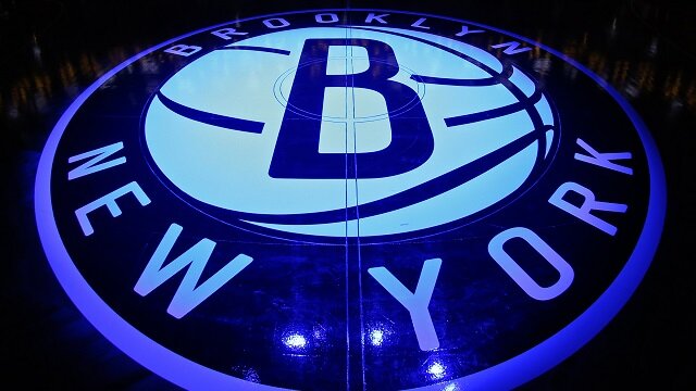
7. Brooklyn Nets
 Credit: Getty Images
7. Brooklyn Nets
The Brooklyn Nets set the standard with their perfectly designed circular crest. Brooklyn's logo seems like a throwback, but looks modern at the same time.
6. Chicago Bulls
 Credit: Getty Images
6. Chicago Bulls
It's hard to think about anything other than championships and Michael Jordan when looking at the Chicago Bulls logo. Thus, it's forever a masterpiece.
5. Charlotte Hornets
 Credit: Getty Images
5. Charlotte Hornets
Speaking of the great Michael Jordan, he made an incredibly wise decision of rebranding the Charlotte Bobcats into the beloved Charlotte Hornets once again after New Orleans moved on and became the Pelicans. It had to be done, and it was.
4. Toronto Raptors
 Credit: Twitter
4. Toronto Raptors
The Toronto Raptors absolutely nailed their logo rebrand. I'm still not sold on their new uniforms, but the logo is fire.
3. Golden State Warriors
 Credit: Getty Images
3. Golden State Warriors
The Golden State Warriors have showcased their fair share of overwhelmingly ugly uniforms and logos throughout the years. But their current primary logo is the type that legends are made of.
2. Milwaukee Bucks
 Credit: Getty Images
2. Milwaukee Bucks
The Milwaukee Bucks pulled off one of the most successful rebrands in professional sports history this year. Every one of the Bucks' new logos are impressive, and they nailed their new uniforms as well.
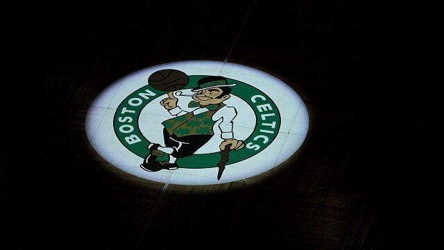
1. Boston Celtics
 Credit: Getty Images
1. Boston Celtics
Legends never die. The Boston Celtics still have the No. 1 logo in the NBA, and likely always will.
 Share
Share