The 5 Ugliest Throwback Jerseys To Be Worn in 2014

Getty Images
During home and away games, NFL teams either wear their home colors or white. There is a special jersey that is worn for certain games. Throwback jerseys have somewhat of a retro style to them and remind us of what the team wore in the past. But some jerseys have us all wondering why they chose that. A prime example is the 2009 Denver Broncos throwbacks. Talk about horror.
Here are the five worst throwback jerseys to be worn in 2014.
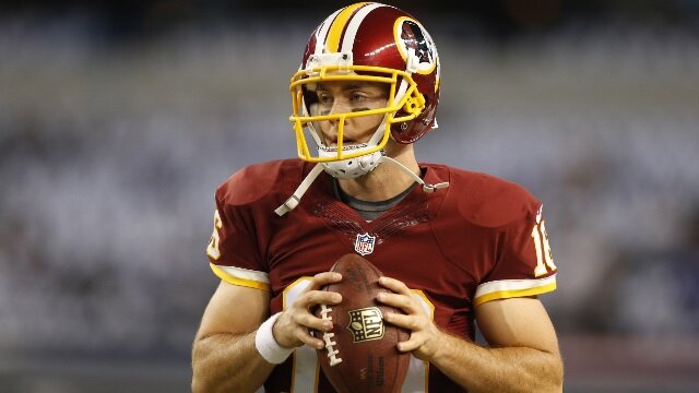
5. Washington Redskins

Getty Images
5. Washington Redskins

Getty Images
4. Buffalo Bills

Getty Images
4. Buffalo Bills

Getty Images
3. Green Bay Packers

Getty Images
3. Green Bay Packers

Getty Images
2. Tampa Bay Buccaneers

Getty Images
2. Tampa Bay Buccaneers

Getty Images
1. Pittsburgh Steelers

Getty Images
1. Pittsburgh Steelers

Getty Images
 Share
Share